Speccer is a zero dependency JavaScript package to highlight elements on web pages and in documentation. It's easy to use and highly customizable, making it the perfect tool for developers, designers, and content creators alike.
Get Started GitHub npmAbout Speccer
Speccer was originally created to make it easier to document components in a design system, but you can use it for whatever you like, whenever you need to highlight any element in your web projects.
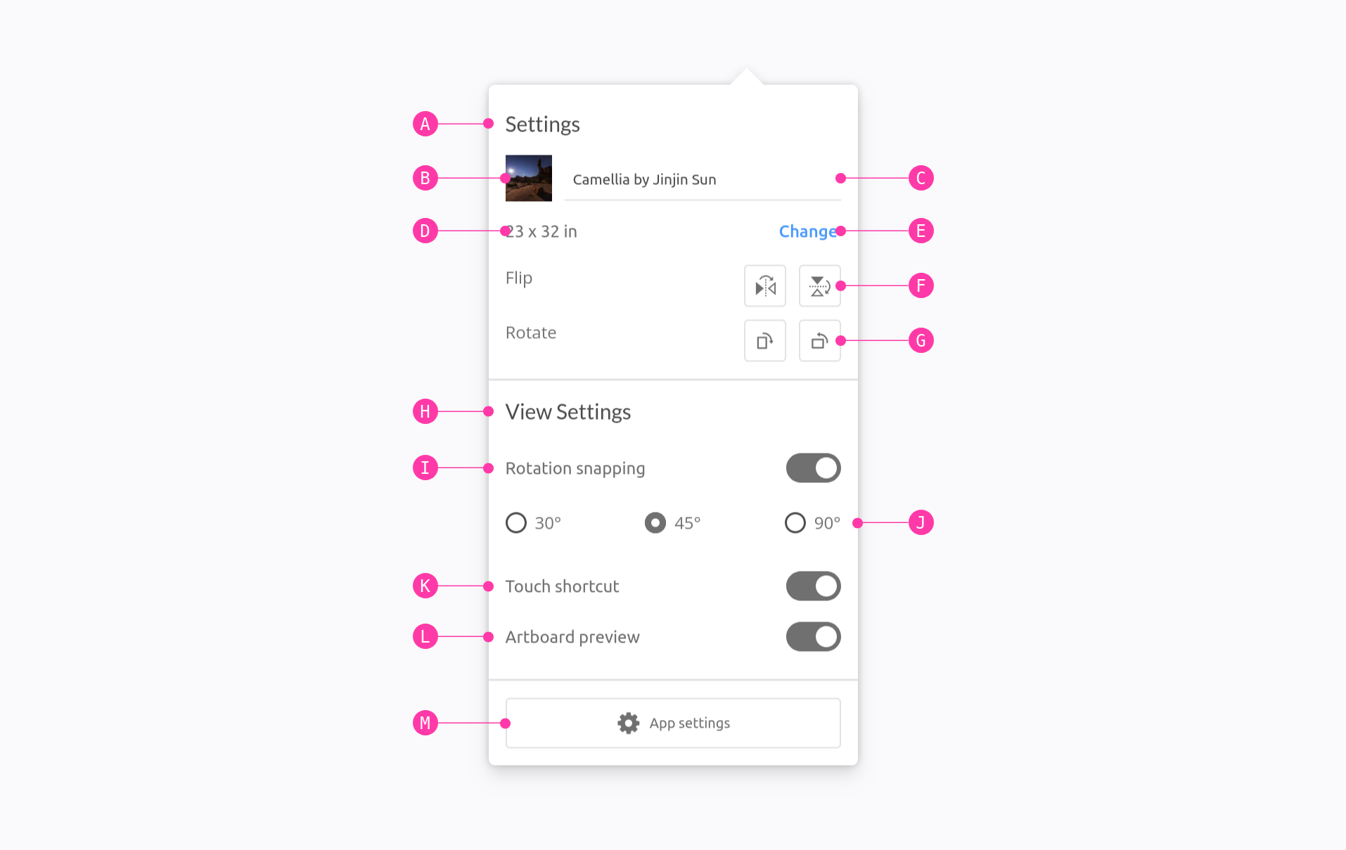
With speccer, you can highlight any element on a web page or in documentation with pins, markers, arrows, and more. This can be useful for a variety of purposes, such as:
- Showcasing the different parts of a component or design system
- Documenting how to use a particular element or feature
- Drawing attention to important information
- Creating interactive tutorials or demos
Speccer is incredibly easy to use. Simply add the
data-speccer (or other tags for
other features) attribute to any element you want to highlight,
and speccer will do the rest. You can also customize the look and
feel of speccer to match your own branding or style guide.
See It in Action
View DemoKey Features
Element Spacing

Easily display padding and margin for any element in your projects.
Element Dimensions

Measure and highlight the width and height of elements with various placement options.
Highlight Anatomy

Pin elements to the outline of an element to showcase its structure.
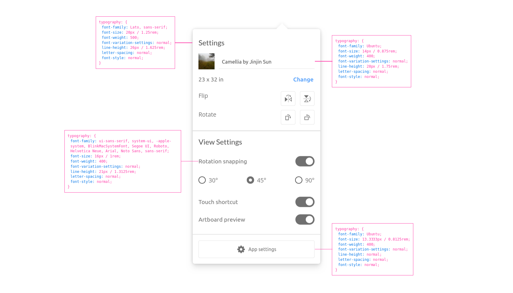
Highlight Typography

Shows the typography of a given element.
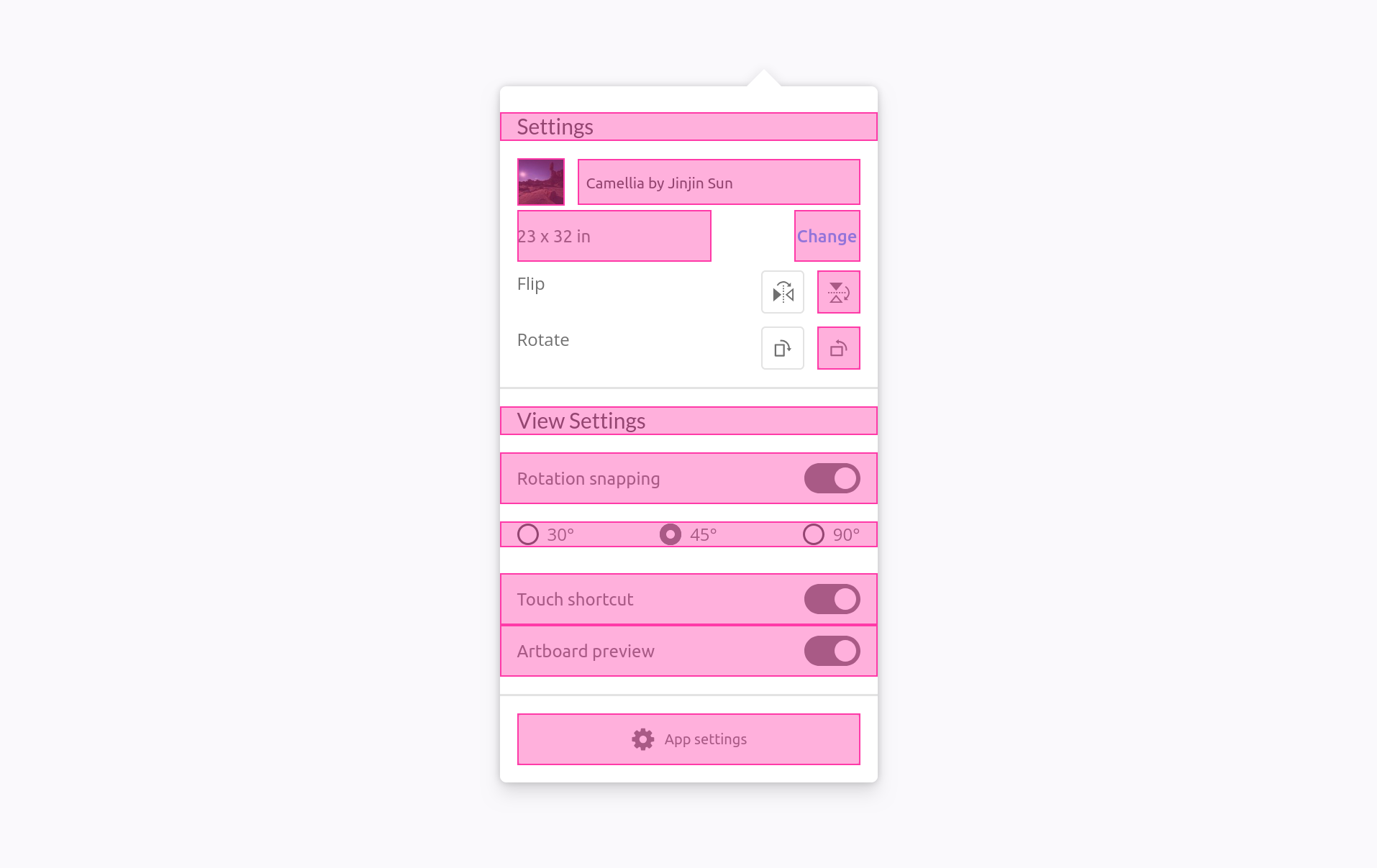
Highlight Elements

Mark elements to reference them.
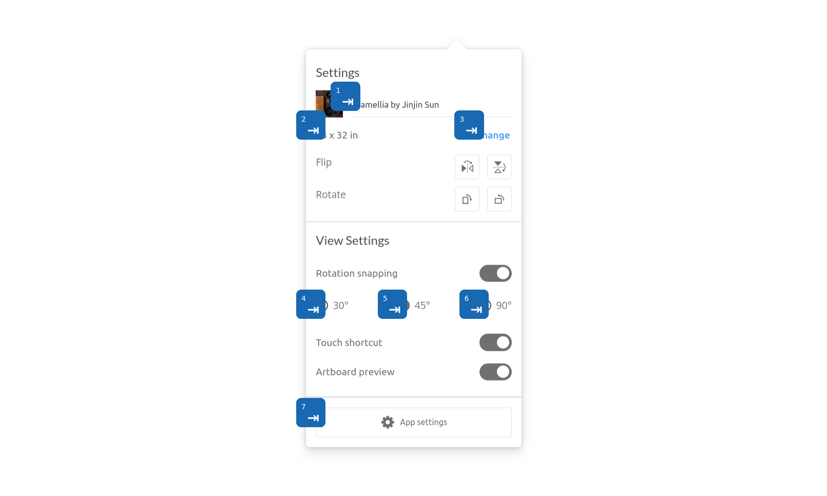
Accessibility notation

Annotate accessibility elements.
Other features
- Zero dependencies
- Open source
- Easy to use
- Highly customizable
- Supports a variety of highlight types, including pins, markers, text and more
- Can be used on web pages and in documentation
Benefits
- Improve the clarity and readability of your web pages and documentation
- Make it easier for users to understand how to use your products and services
- Create more engaging and interactive tutorials and demos
Get Started
Ready to enhance your documentation and web projects? Follow these simple steps to get started with SPECCER:
- Install SPECCER via npm:
- Choose your preferred integration method, whether it's Typescript, ESM, Script, or React.
- Customize the styling to match your project's design.
npm i @phun-ky/speccer
It is always up to date
Speccer is always up to date, ensured to you by the author!
Want some fancy specifications, measurement or pins to your example components in your styleguide/component library? Use speccer! https://t.co/sd6OaTOAUL #frontend #designguide #styleguide #ux #documentation pic.twitter.com/ncotWGm2HL
— Alexander V. R-H (@phun_ky) November 16, 2018
API Documentation
For a detailed understanding of speccer's API, refer to the API Documentation.
Customization
Speccer offers flexibility in styling. You can customize its look and feel using CSS variables or apply CSS overrides to match your project's design preferences.